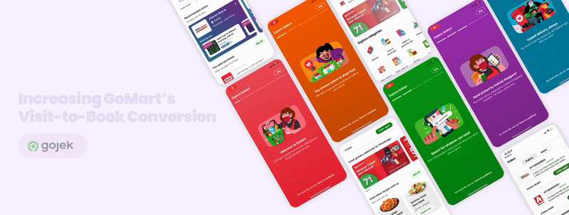
Improving the Visit-to-book Conversion in GoMart App (Gojek's Grocery Delivery)
ROLE
Designer, Researcher
TIMELINE
5 months
TOOLS
Figma, Miro, Overflow
IMPACT
-
We successfully increased the booking conversion for GoMart from 7% to 20% within the span of 5 months, by implementing a new navigation and revamping the GoMart homescreen.
-
Additionally, we saw a 8% increase in the return rate for new users.
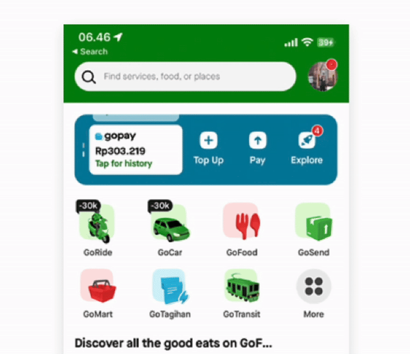
WHAT IS GOJEK?
GOJEK is a one-stop platform in Indonesia that started as a ride hailing, and it has expanded its services to include grocery delivery, payments, food delivery, logistics.
GoMart is an on-demand grocery delivery service from GOJEK that help users buy their daily needs online from supermarkets, convenience stores, pharmacy, pet stores, flower stores. User orders from our merchant, and the rider will deliver it ASAP.
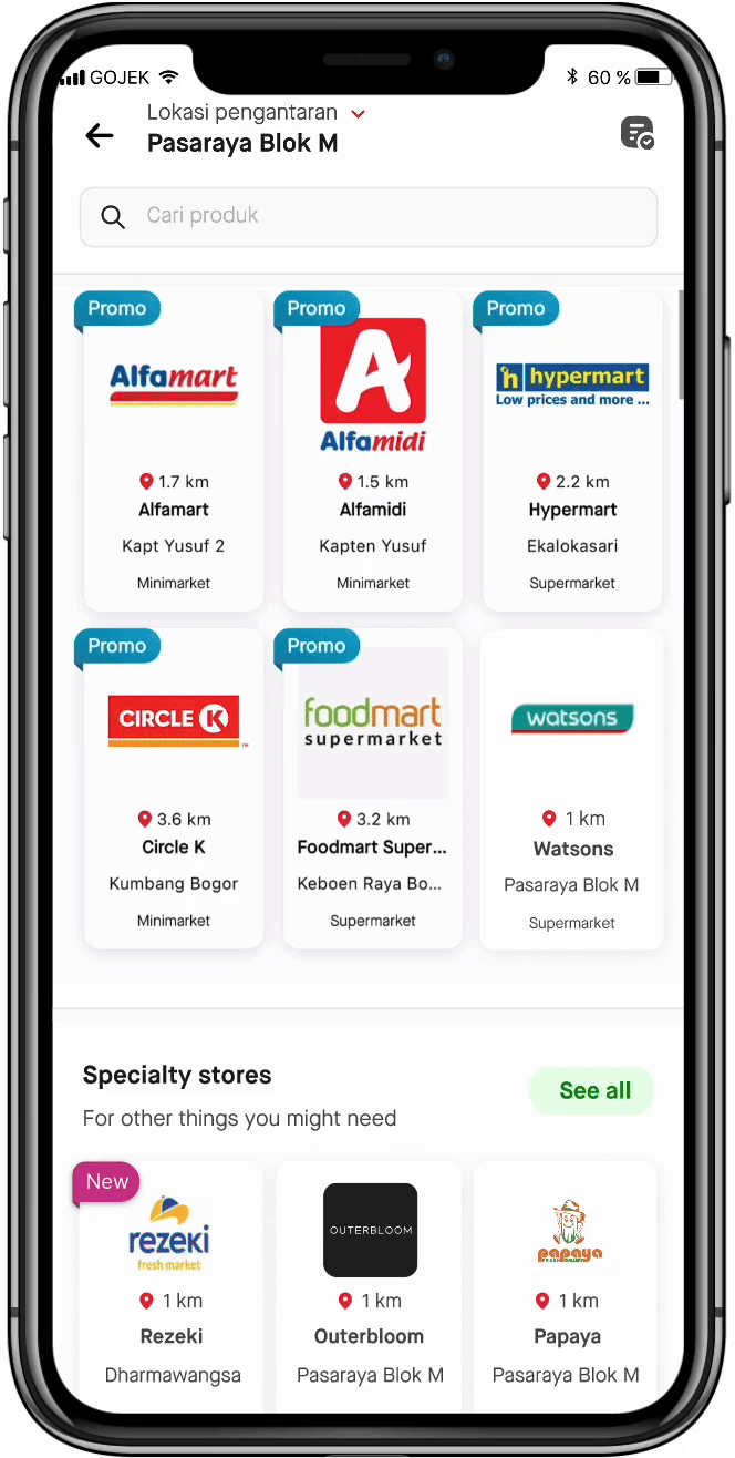
BEFORE REDESIGN
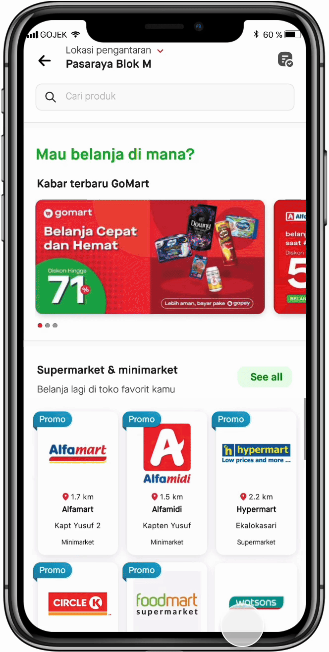
All the intended action is triggered from the home screen, where we show banner, followed by exposing list of stores, past purchase, and all stores..
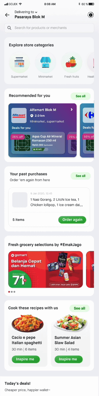
AFTER REDESIGN ✨
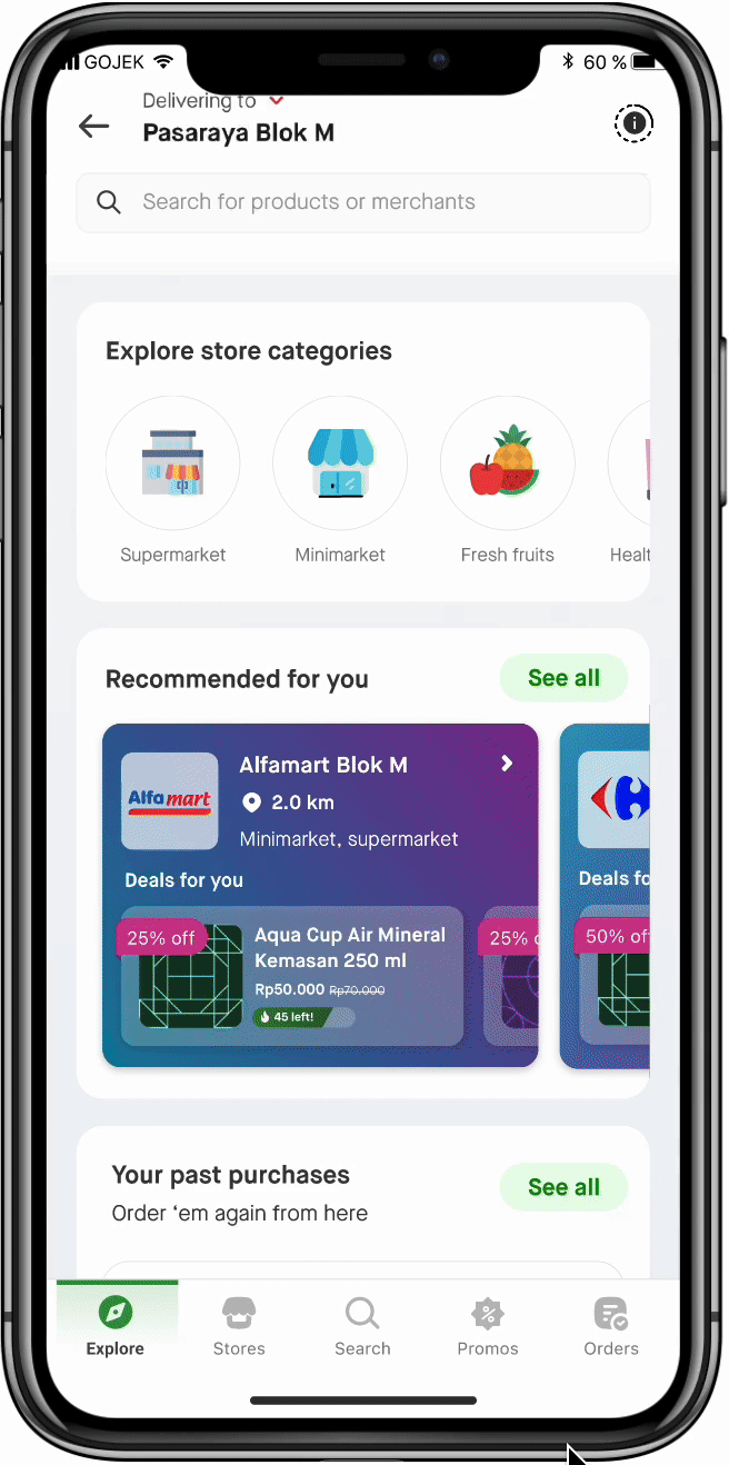
Enabling users to navigate easily with a navigation bar, which allows us to utilise home screen to educate users and tailor the experience.
WHERE WE COULD BE

How it could look like in the future with dark mode ✨
01
PROJECT CONTEXT
BACKGROUND
GoMart has been experiencing significant drop-offs, with 41% of users leaving without interacting with key features inside the app.
PROBLEM STATEMENT
It poses a challenge to find what users want on the GoMart landing page as even with the existing features on the app, we were seeing high bounce rate after minimal engagement. This limits GoMart’s ability to convert visits into booking.
GOALS
1. Improve user navigation flow through GoMart funnels
2. Increase user interaction with GoMart features, leading to Checkout.
SUCCESS METRICS
1. Increase in visit-to-book conversion
2. Decrease in bounce rate
3. Increase in return rate
02
DISCOVERY
EXISTING FLOW
Currently, all the intended actions is triggered from Home screen, where we show the banner, followed by two grids of stores for Supermarkets and Specialty Stores, followed by past purchase, and a never-ending scroll of all stores.

1. Search bar click: 22.6%
2. Order history click: 1.4%
3. Banner click: 2%
4. Store click: 29.8%
5. Store promo click: 3.2%
Bounce rate: 41%

FUNNEL ANALYSIS
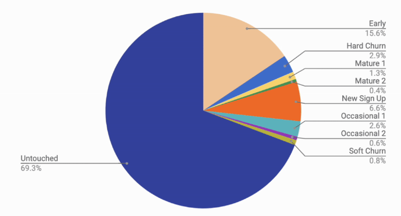
On the homescreen, what do our customers mostly do?
CUSTOMER PROFILE
-
Untouched: The users that haven't been engaged or activated yet
-
Early: Relatively new users, but have shown some initial activity - in the early lifecycle stage.
-
New Sign Up: Recently registered but with no activity.
-
Hard Churn: Previously active users who have now fully disengaged.
-
Occasional: Infrequent users with light or irregular usage.
-
Mature: Regular, loyal & high-value users.

OBSERVATION #1
Across all diagrams, the largest segment of people who bounce off is the Untouched group.
Hypothesis:
The new users are exploring out of curiosity but they are not finding a reason to stay

OBSERVATION #2
Early users struggle to engage from all the sections.
Hypothesis:
They have difficulty navigating or finding value in the app’s offering

OBSERVATION #3
Merchant page is underperforming for both new and returning users.
Hypothesis:
The pages might not be offering compelling content to keep users engaged.
IN-DEPTH INTERVIEW
Period: 19-24 March 2021
RESEARCH BACKGROUND
There is a quite significant drop in the GoMart homepage, in which customers bounce from the homepage without clicking on anything (e.g. banner, search bar, merchant page, or promoted SKU in the homepage).
RESEARCH OBJECTIVE
-
Gather behavioral insights around the causes of the funnel drop
-
Leverage user insights or perceptions to build a good GoMart onboarding flow.
RESEARCH OUTPUT
-
Identify key user pain points
-
Identify key behavioral patterns
TARGET AUDIENCE
n = 10
-
Customers residing in Jabodetabek 🇮🇩
-
Have a Gojek tenure between 950 - 1.050 days as per March 2021
-
Arrived at GoMart homepage on 13-14 March 2021
-
Segmented into sample groups as follows, participants are mutually exclusive


RESULT
Untouched and early users can easily grasp the early ordering steps of GoMart, their understanding about how the service fully works was incomplete or misleading. This becomes a big blocker for them to explore the app further & create an order.
WHAT OUT CUSTOMERS SAID
"My friend told me about GoMart to buy grocery. But I didn't know how fast delivery would be, and I also just found out that the stores and assortments were varied."
-- Nining, 33 years old, Untouched GoMart user bounced from Homepage

"I saw a lot of GoMart promo banners on homepage, that's how I learned about it. But when I came to check, the promo was no longer applicable, so I changed my mind and did not buy anything.

-- Fandi, 27 years old, Untouched GoMart user bounced from Homepage
"Well, when I think of it... who has been picking up the items at the store? Is it the driver or is there a specific person who picks up the order? No explanation at all on the app. I am concerned about the quality of the fresh items.."

-- Nuratika, 35 years old, Early GoMart user bounced from Merchant Page
There was no step-by-step or walkthrough for first-timers. I clicked around for a bit, but I couldn’t figure out how the process worked, so I left."

-- Salma, 36 years old, Untouched GoMart user bounced from Home Page
DISTILLING PAIN POINTS
-
User felt overwhelmed by the cluttered homepage
-
User found it difficult to understand GoMart's value propositions (especially as New users)
-
User struggled to navigate to the products they needed,
DISTILLING USER BEHAVIORAL PATTERNS
-
Deal-hunters browse frequently to maximize the savings
-
Some look to find specific products quickly
-
Some look out of curiosity
03
DEFINING
How might we improve GoMart navigation to encourage users to explore key features, reduce drop-off, and enhance their overall experience?
IDEA EXPLORATION 💡
Based on the research that was conducted, I proposed several ideas to increase our overall visit-to-book conversion, mainly targeted for our untouched and early customer segments.

After prioritizing based on feasibility and impact, we narrowed down to three key areas:
-
Improving navigation → Making it easier for users to browse categories, discover stores, and understand how to start. This addresses key user pain points around confusion and hesitation,
-
Educating and informing users → Adding clearer explanations about GoMart's value proposition, how the service works, and what's the unique selling point.
-
Better deals discoverability → Good strategy to cater to our deal-hunting customers

COMPETITOR BENCHMARKING
I benchmarked against 4 local online grocery players on their navigation: Happyfresh, Klik Indomaret, ShopeeMart and Sayurbox.

04
IDEATING
WIREFRAME
ITERATION I
Initial navigation bar:
Homepage (Explore) → Search → My orders (Ongoing & Past)

In parallel, we also identified 4 GoMart user discovery modes, after distilling from research, based on:
(1) their shopping use case, and
(2) focus on content sought (the kind of content they focus on seeking when opening GoMart.)

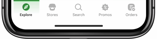
After alignments with Business and Tech counterpart, plus taking into consideration the Competitor landscape and incorporating our four user discovery modes, we decided to settle down with having five components on the bottom navigation bar -
Home, → Merchant, → Search, → Promo, → My Orders
1. This simply follows the common trend of the human eye (of scanning from left to right) so naturally, the components with the previously biggest CTR will be placed from the left, for better familiarity and increased prominence.
2. This was also aligned with the four different user discovery mode that we distilled previously:

DEFINE MENUS
REASONING

WIREFRAME
ITERATION II
Updated navigation bar:
Homepage, → Merchants, → Search, →Promo, → My Orders (Ongoing & Past)

IN-DEPTH INTERVIEW + CONCEPT TEST
Period: 19-24 March 2021
RESEARCH OBJECTIVE
-
Understand customers' experience while navigating through the current app.
-
Understand customers’ needs and expectations for the navigation process.
-
Find ways to improve the navigation process inside GoMart (not limited only to the navbar).
-
Understand customers’ perceptions towards the proposed GoMart navbar & Homepage redesign.
RESEARCH OUTPUT
-Recommendation for our navigation bar hierarchical positioning
-Recommendation for our new Homepage redesign
TARGET AUDIENCE
n = 6
-
Segmented into Mature, Early and Untouched users based on their past purchase behavior with GoMart.


WHAT OUT CUSTOMERS SAID
"Feels less overwhelming. I can just scroll down and find a lot of interesting sections now! Previously there were just too many stores being shown, a bit boring."

-- Abi, 39 years old, GoMart mature user
"The promo as a navigation tab is so smart! It saves me a step. I usually ignore promo banners but this one caught me."

-- Fauzi, 25 years old, Untouched GoMart user
RESEARCH SUMMARY
-
6/6 participants preferred the proposed bottom nav layout over the previous hamburger menu.
-
5/6 said they now use the nav bar to browse instead of only relying on search.
-
5/6 found it easier to locate what they were looking for compared to the old version.
Interesting observation:
-
Untouched users in particular were more likely to click on category shortcuts and banner promotions.
What can be improved:
-
2/6 said that the 5 tabs are a bit overwhelming. As quoted: "It’s not bad, but for someone new it’s a lot to take in at once. Maybe fewer tabs?"- Athalia, 39 years old, mature GoMart user.
-
3/6 wished the active tab indicator was more prominent (color, underline, or animation).
-
2/6 said that usage of "merchant" sounds a bit weird.
OVERALL DISCOVERY & NAVIGATION ISSUES:
With the bottom navigation bar, what can we offer? 🟪

INFORMATION ARCHITECTURE
Defining the structure and relationship between all areas of a site, and informs the sitemap

05
FINALIZATION
FINAL DESIGN
BREAKDOWN
1. Added bottom navigation bar
Enabling customers to easily navigate between tabs, with these options: Homepage, Store, Search, Promo, and My Orders
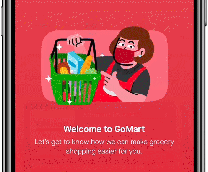
2. Added "stories" feature to give an onboarding of what GoMart offers
As a result of introducing the navigation bar hence saving up space, we are able to introduce these pages to help Untouched users know GoMart better.
The stories are divided into five different sections for easier digestibility
:Welcome to GoMart → Choose where to shop from → Search for whatever they need → Who picked the order →How fast the delivery was
3. Reducing redundant contents on Homescreen
Before, store categories took up a large portion of the screen. Now, with the addition of the bottom navigation bar, we’ve created space to relocate these categories into a dedicated section. On the home screen, we now display:
-
Fewer store categories, since they now live in their own dedicated section
-
A more contextual "Recommended stores" section, tailored by distance and available discounts.
-
Dedicated tab for Promotion, to cater for our deal-hunter persona.
PREVIOUS EXPERIENCE

NEW EXPERIENCE
IMPACT
-
Increased the Visit-to-Book rate from 7% to 20%
-
8% increase in the return rate for new users.
FURTHER IMPROVEMENT
1. Contextualizing the content (playing with the information hierarchy) in homescreen
2. Playing with dark mode (consistent with GoPay's effort in adding dark mode)
.jpg)
WHY THAT SPECIFIC STRUCTURE?
-
The sections on top will be sections tailored to the users: the store categories, recommended stores, past purchases.
-
The sections in the middle will be for further discovery and exploration: promotional banner, recipe, store list.
-
The last section: bottom navigation bar with five options: Homepage, stores, search, promo, and my orders.