
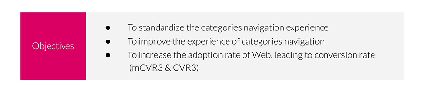
Background
In Groceries | Q-Commerce, we have DMarts (pandamart - Dark stores) and Shops for Asia Pacific, SEA and European market. Currently, Dmarts and Shops experience for category navigation isn’t standardized.
We also discovered some other problems:
-
Lack of visibility for all categories
-
Improvement needed for the Information Architecture
-
Long loading time when navigating between categories
Link to live website
Norway 🇳🇴 - https://www.foodora.no/darkstore/hgbg/foodora-market-sofienberg/
Finland 🇫🇮 - https://www.foodora.fi/darkstore/bg6k/foodora-market-ruoholahti/
Czech 🇨🇿 - https://www.damejidlo.cz/darkstore/l1hl/dame-market-chodovska/
Austria 🇦🇹 - https://www.mjam.net/en/darkstore/r3it/mjam-market-oper
What do we know about the problem?
Of all the people who entered the Shop Description Page (SDP) last year, only 25.8% proceeded to the Checkout Page. We can see that only 28.0% of the people who accessed the Shop Description Page for Dmart (our darkstore) proceeded to checkout. The number is even lower for our partnered Shops with 20.7% only.

Existing Audit
We conducted a workshop with the Product and Tech team, where we first wrote down the whole experience for Web Categories Browsing in foodpanda, and listed:
-
What we liked about the experience (plus points) → Green sticky notes 🟩
-
What we didn’t like (pain points) → Black sticky notes ⬛️
-
Some other thoughts we found → Yellow sticky notes 🟨

Existing Journey
We also deep dived on the Store Detail Page screen for Dmarts (our darkstores → pandamart), and for shops (our partners → stores like Watson, Seven Eleven, and other specialty stores).
Industry Landscape

Competitor Analysis
I conducted competitor analysis on six of our global competitors — Instacart, UberEats, Grofers, Deliveroo, AmazonFresh, and Coupang. I specifically focused on the web category browsing experience.

User Stories
-
As a User, I want to be able to immediately view the categories offered by the shop, so that I can:
-
Determine if the product assortment fits my browsing intent,
-
Realize that the shop has sufficient products
-
-
As a User, I want to be able to quickly toggle between categories and subcategories so that:
-
I can find my intended categories with minimal steps
-
I can discover the product assortments offered
-
Design Explorations
Jinyi and I (designers in Groceries) did an exploration for the wireframes, put on Miro

Visual Designs
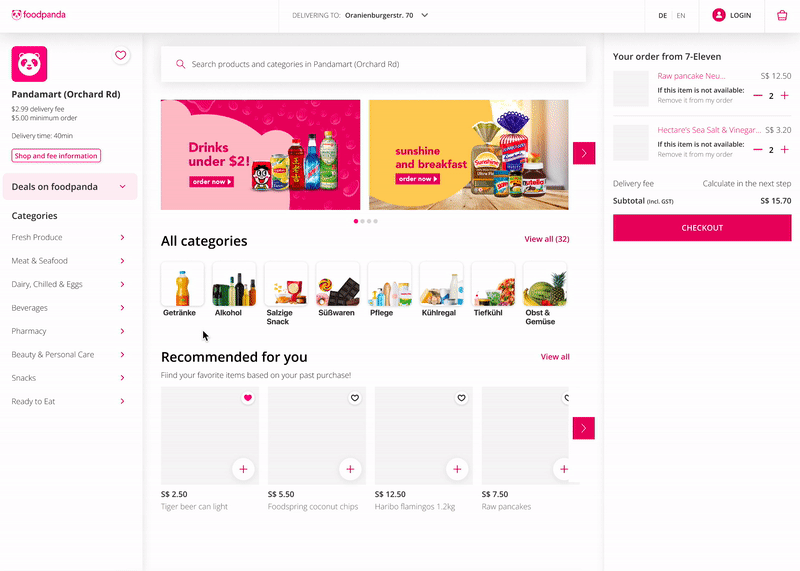
After the explorations, I created the high fidelity design for the Store Detail Page. Previously, we have two different experience for both the Store Detail Page for shops (partners) and Dmarts (our own dark stores → pandamart).
On the right screen, I created a unified Store Detail Page.

Details


Feedback
Feedback was mostly around accessibility and readability of the information inside the page.
Refinements

Usability Testing
Total: 20 Participants — 6🇵🇭PH, 1 🇩🇪DE, 3 🇬🇧GB, 3 🇮🇳 IN, 1 🇳🇱NL, 2🇧🇪BE, 1🇧🇬BU, 1🇵🇹PT, 1🇷🇺RU
-
Web users only
-
Varied countries
-
Varied ages, education levels, genders, technical proficiency
Methodology
Unmoderated test on Usability Hub
Usability Testing Goals
-
To assess whether users can understand the new category navigation experience in a store
-
To assess if users can find their intended categories, sub-categories & deals with minimal steps
-
-
Gain insight into the overall impression of the new category navigation improvement in Groceries
Usability Testing Objectives
-
To determine design usability within the new user interface.
Results


Conclusion & Design Changes
-
Ensure to write category names as closely as possible (Work on the UX copy)
-
Enable clicks on several sections of the design for better navigation and intuitiveness
-
Consider multiple entry points for Deals apart from the category side-panel
-
Potentially working on the colors (increase contrast for better readability)
