Building B2B e-Procurement Marketplace for Tokopedia

ROLE
Designer, Researcher
TIMELINE
9 months
TOOLS
Figma, Miro, Surveymonkey
IMPACT
We successfully opened a new revenue segment market for Tokopedia. The platform was rolled out internally at first, which reduced procurement cycle by 30% on average, lowering invoice disputes and delivery mismatches.
01
PROJECT CONTEXT
BACKGROUND
Users currently have a bad experience when discovering & using incentives available to them. Based on our Customer 360 conducted on March 2024, we found out that customers view our platform as less affordable due to a perceived lack of incentives and difficulty in finding promotions. Based on our Net promotor score, customers said it was hard to find voucher codes as well, as there's no unified way to receive information about new promos/ voucher.
Vouchers that could save users money are currently only accessible at the cart page, meaning users can miss out on potential savings earlier in the ordering process.
"Where should I look for discounts?" - Czech user
"Too little promos and discounts, and lately all the delivery fees are spiking up." - Malaysia user
"There aren't that many discounts or promotions, and when they are, I don't get notifications." - Pakistan user
-- Past User Voice, from SEQ and NPS 2024
PROBLEM STATEMENT
-
Users are not able to apply vouchers before Cart while deals are being auto-applied
-
There is a gap in showing MOV progress for vouchers while deals, and delivery discounts progress are shown in RDP. Users have to go to cart to check voucher’s MOV progress before coming back to RDP to add more items.
-
Users find it unclear that vouchers, deals and delivery discount can be stacked, impacting affordability perception
GOALS
-
Boost voucher visibility
-
Enhance perception of affordability
-
Increase conversion from Menu -> Cart page
02
DISCOVERY
EXISTING EXPERIENCE
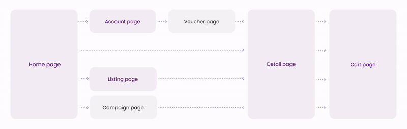
PROBLEM #1: Scattered entry points of Incentives
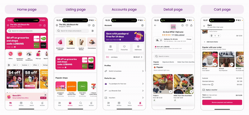
We have various entry points throughout the journey (Homescreen, Account page, Wallet page, Restaurant listing page, Restaurant detail page, and Cart page). They areall inconsistent, shown by how they have different visuals.
PROBLEM #2: Lack of clarity on Voucher application
Currently, the only way to apply for voucher is on the Cart page. Customers has to manually select the voucher and we don't currently communicate once they have hit the minimum order value to be eligible for a voucher.
WHY DID WE DECIDE TO REVAMP THE BOM?
The previous version of the Buyer Order Management page was functional, but it followed a traditional data table format — a layout that works well for bulk processing but falls short when it comes to clarity, usability, and decision-making for complex B2B transactions.
1. The old layout is too table-centric and resembled a spreadsheet: minimal visual hierarchy, hard to scan at a glance. Key information (like item details, status, and CTA) was buried in rows, requiring users to read line-byline.
2. Low visual affordance, orders felt abstract - no product photos, contextual details, just text. This limits user's ability to quickly identify specific transactions or prioritize actions..
3. Limited filtering and navigation, as they weren't emphasized, resulting in users overlooking them or spending extra effort to narrow down results.
IN-DEPTH INTERVIEW
Period: August 2020
RESEARCH OBJECTIVE
-
Gather behavioral insights around the procurement process
-
Leverage user insights or perceptions to build a good B2B Procurement marketplace.
RESEARCH OUTPUT
-
Identify key buyer pain points on the end-to-end procurement process
-
Identify key buyer journey
TARGET AUDIENCE
n = 13
Criteria
-
People in-charge of purchasing goods/services in their respected company
-
8 [of 13] from internal Procurement team, where 2 [of 8] is procuring services
-
2 [of 13] from official Store seller (Small-to-medium Enterprise)
-
3 [of 13] from external big corporate
-
FINDINGS FROM RESEARCH
END-TO-END FLOW
This diagram shows the full B2B procurement journey, from sourcing to after-sales service. It shows how buyers start by discovering suppliers through search results or supplier pages, then move into a negotiation phase that includes supplier comparison, open tenders, or direct contracts. Once a deal is made, the process continues through order execution, goods receipt, billing, and finally, post-purchase support.
The Buyer Order Management system sits at the heart of the operational phase—covering buying execution, goods received, and billing—where users actively manage and track their orders. This area is crucial, as it allows buyers to monitor transaction statuses, view product details, contact suppliers, and ensure the procurement process flows smoothly end-to-end.

BUYER ORDER MANAGEMENT: NEEDS & OPPORTUNITIES
Buyers need a centralized dashboard that simplifies how they track and manage orders, especially across billing and legal-related cases.
Two core requirements were identified:
-
A chronological view of all order activities (order timeline) is essential to resolve billing disputes or legal matters quickly.
-
Buyers want an all-in-one space that consolidates company data, billing, and order history, improving ease of navigation and operational efficiency.

BUYER ORDER MANAGEMENT: GOODS RECEIVED


Pain point:
Inefficient communication between suppliers, procurement, and users to confirm goods received.
Idea:
Confirmation for Goods Received by procurement team on the platform
BUYER ORDER MANAGEMENT: BILLING & PAYMENT

Pain point:
Inefficient communication for incomplete invoice documents
Idea:
Accept or reject uploaded invoice documents on platform
*Documents needed:
Purchase order, BAST/Delivery Order, Invoice, Tax Invoice, Agreement Document, etc..

03
DEFINING
How might we enable users to efficiently track and manage their large-value B2B transactions, ensuring a smooth experience from processing to receipt of goods efficiently?
COMPETITOR ANALYSIS
Conducted research to our B2B competitors, such as: Ralali, Bizzy, Mbizmarket, Monotaro, and Alibaba.
-
Buyer's entry point to manage their orders
-
How buyers track their orders
-
Competitor's transaction flow end-to-end process
-
Components in the Buyer Order Management page

WHAT WE BENCHMARKED:

FINDINGS
1. Order Timeline
Buyer needs a timeline history of their order when dealing with billing or legal cases to speed up their work
2. Dashboard
Buyer needs an all-in-one space in terms of ease of navigation, where they can manage their company data, billing & payment for their order management
USE CASE SCENARIO
I have defined the use case that will most likely happen in the platform, with various scenarios as seen from the table below.

PROPOSED FLOW: BUYER ORDER MANAGEMENT

INFORMATION ARCHITECTURE (IA)
Created these IA for Buyer Order Management to capture our user's needs. In result, we could prioritize which architectural components are more crucial to build first.

WIREFRAME
04
WIREFRAMING

WIREFRAME
1. ORDER & BILLING LIST

Follow the Natural Use Flow (Button positioning)
Decided to place all the CTA buttons towards the right of the content on Order List, for buyer to easily scan all the information on the left instead of a full-width content.

2. ORDER DETAIL AND TIMELINE

New Order Detail Page
Decided to design a new page for order detail instead of leveraging the existing modal from our C2C marketplace, as the information that needs to be shown for buyer are different, and more complex for us.

Emphasize several components for the new order detail page, such as:
1. Progress Bar: to show the order's current progress (Grouping several statuses for easier scannability)
2. Timeline: to show the progress in detail in a new tab for easier navigation instead of scrolling to the bottom
3. Dynamic message: a brief description of the order progress & several dynamic CTA depending on the progress or the status

3. REVIEW INVOICE
These are the new steps for B2B transaction, in which buyer has to review the invoices (if they click this, it will be viewed in the new tab) that was sent by supplier after the goods were received.

USABILITY TESTING
RESEARCH OBJECTIVE
-
To evaluate whether the proposed wireflow for the B2B Buyer Order Management (BOM) system is understandable, intuitive, and usable by procurement professionals
RESEARCH OUTPUT
-
Identify potential pain points, confusion, or usability friction in the flow
-
Insights on: navigation clarity, comprehension of order statuses and actions
-
Recommendations to improve layout, wording, and interaction flow
TARGET AUDIENCE
n = 5
Criteria
-
Procurement specialists in Tokopedia
-
Leverage Tokopedia C2C Marketplace as buyers
-
RESEARCH FINDINGS

KEY BREAKDOWN INSIGHT
-
We observed a 60% drop-off after users confirmed goods received. (This was evidenced by users pausing for 20+ seconds, and expressing confusion out loud (User #3: Where did it go to?').
-
📉 Average time spent locating the next step: ~37 seconds, including re-clicking tabs and using Ctrl+F.
-
In follow-up questions, 3 out of 5 testers expected the invoice review to happen on the same page or within the same flow. Instead, their orders silently moved from the Transaction tab to the Billing tab — creating confusion, disorientation, and loss of task continuity.
WHAT WE CHANGED
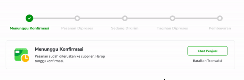
This flow represents what happens after a buyer has made a purchase in Tokopedia’s new B2B platform. The user needs to go through three key steps:
-
Confirm the goods have arrived (i.e. “Yes, I got the stuff.”)
-
Review the invoice (check if what the supplier billed matches what was ordered)
-
Make the payment

05
HIGH FIDELITY DESIGNS
1. Order List

Solution 1: Revamping from Table to Dashboard
Drastically I have transformed a whole layout of our Buyer Order Management from "a table" in the previous design phase to be an expandable dashboard.
Hence we can cater to wider use cases, as per the problems that we've discovered.


Solution 2: Visibility Improved
Timer + Status
Most participants stated that the timer was too small and was not clear enough about what kind of information it tried to imply.
For iteration, we’ve decided to combine the timer, status & ticker into a new component for buyer to create a more sense of urgency.

Solution 3: Navigation
I took consideration to improve existing C2C sidebar navigation. We found that its hover interaction might be hard to highlight the menu inside. Also prone to click errors.
So I solved this problem by simply changing the interaction from hover to click.
2. Order Details

Solution 1: Revamping from Pop-up to Page
From research and analysis earlier, order details are designed to be pages instead of pop-up, pages also have better expandability in future design and development than pop-ups like in C2C.

Solution 2: Clearer Progress Bar + Personalized Dynamic Message
I founds that users need effective ways to find out the status of their transactions and quickly decide what next relevant actions they can take.
Therefore I made a new Progress Bar along with messages and relevant actions that change based on the status of the order.

Solution 3: Envelope-styled address card
Mimicking the address card similar to envelope design with red-blue stripe to emphasize that it contains mailing information, and making the design look less transactional..


IMPACT
We successfully opened a new revenue segment market for Tokopedia. The platform was rolled out internally at first, which reduced procurement cycle by 30% on average, lowering invoice disputes and delivery mismatches. lower invoice disputes and delivery mismatches.